The maps I selected are median household income, population density, and median housing value.
Ohio seemed to have some strange distribution as far as highest median household income goes. Going in, I had expected to see a bias toward the larger cities, but got a somewhat stranger result. Rather than being the counties of the major cities, the areas of the highest household income were all directly next to a major city, but distinctly excluded the major cities themselves. I checked a few different possible things to see if there were any correlations, such as race, bachelors or higher education, labor force size, and unemployment rates, with little to no results. The only thing I came across was median housing value correlating, though I would assume this would be a result of the stronger industry in these areas, and not the other way around. This would need further research to analyze to any meaningful degree.

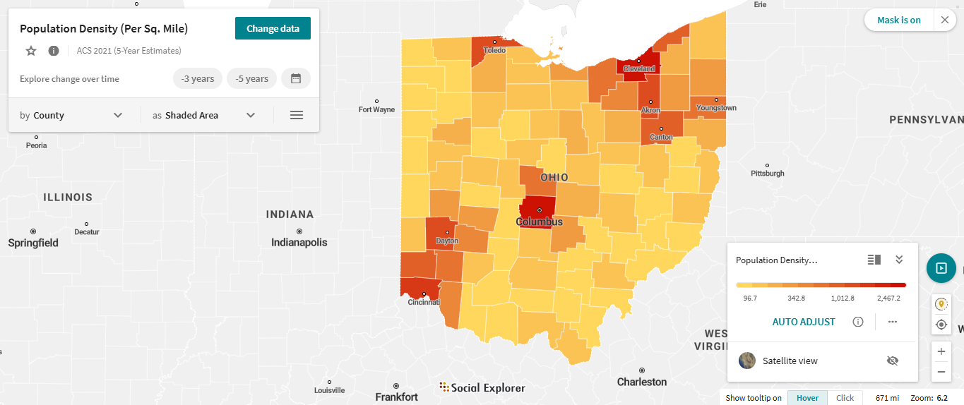
Notice how the darkest counties on the lower map of population density seem to be rather low on the income map on top, but are surrounded by 1-2 significantly higher income counties.

1 comment:
One reason why there is probably high rates of income in the areas around big cities is because they are residential areas. These areas are probably filled with suburban housing. This would be because of urban sprawl which is when people flee from urban cities to rural or suburban areas. This mostly stems from overcrowding, perception of crime within urban areas, general fear, etc. Another reason is that there might be a larger incomes in these counties is because of an increased amount of commuters that travel from the surrounding residential suburbia to the urban cities for occupational purposes.
Post a Comment