Friday, August 30, 2024

Evy's Interesting Map


 This is a map from 2019 (the most recent I could find) of the wealth of an average adult in every country, represented by colors. The black represents the highest wealth at 100K and above, while the dark pink shows that the average adult in that country owns less than 500 US dollars.  I found this map very interesting but also very sad. The average adult has between 1 and 5K total which is not enough to really sustain someone if they have a serious medical issue or something that they need to buy. Especially for people who have children, this is a low amount of money to be working with. 

It's also devastating to see the effects of colonialism, imperialism, and slavery still playing out in different areas and especially Africa. In many ways, Europeans stripped places such as Africa of their natural resources and left them struggling economically, not to mention the effect of the trans atlantic slave trade on this continent. These economic implications I believe are still being seen today. 

I think this map also shows the effects of war in the Middle East, as Afghanistan is another country with the lowest wealth on the map. I wonder if there was a more recent map if Russia and Ukraine would be different due to the war there, and I wonder the same about Israel and Palestine. 

I also find it interesting that Canada has more wealth on average than the US, which I was not expecting. I wonder why that is! Maybe Canada doesn't have as many places where people are living in poverty as the US does. I see also that Japan, Ireland, France, and some other countries are in the highest wealth bracket. 

We hear all the time about how privileged we are to be living in the US, but we really are. We have so much more than we think we do. I hope that one day this map can be changed, and people's average wealth around the world will rise.

Thursday, August 29, 2024

Desmond’s Interesting Map


This Map shows Caribbean countries and the language that they speak. The formal language of most Caribbean countries use is influenced by the country that the were colonized by the Caribbean was colonized by four main colonies: Spanish, French, English and Dutch. The territories that they colonized adapted their language. The Spanish colonized most of the larger islands but eventually lost control of Jamaica to the British who now speaks English as their official language. The most interesting island on this map is Hispaniola which is made up of Haiti which was colonized by the French and Dominican Republic which was colonized by the Spanish. The British colonized most of the islands in the lesser Antilles. The Dutch had the least influence, they colonized a few islands to the north of Venezuela and a few other small territories. Many of the Caribbean countries also speaks creole which is mixture of their colonizer language and their native language.

Spencer's Interesting Map


My interesting map is a historical map from 1876 theorizing on the origin and spread of humans across the globe.  This overall, as well as anything it covers isn't anything special to me, however.  Of particular interest, and what I wanted to share is the now disproven theorized land mass of Lemuria.  In the 1800s, it was discovered that there were lemur, or some other similar primate, fossils found in both India and Madagascar, but no records of them being anywhere in between.  The first theory for how this came to be was that a land bridge had connected India and Madagascar, with some depictions stretching this hypothetical landmass out to Australia or other sections of the Oceania region, as well.  The existence for this region would later be disproven by the discovery of plate tectonics and continental drift, which is our current reason for the discrepancy in the fossil record with far more supporting evidence, leaving Lemuria a forgotten theory of history.

Asia's Interesting Map

In-Game Map Ascent:

    This Map is from a videogame called Valorant. Valorant is a FPS game available on PC, and console. The map itself is called "Ascent." Valorant released on June 2, 2020, with Ascent. It was one of the first maps released into the game. Ascent is based off of Venice, Italy. In the map itself, it has references to Italy within it's architecture and its ruins. 

    In Ascent they have 2 plant sites, and a space in the middle to connect it all. On the map for Ascent, there are places that most players use to indicate where they are, where the enemies are, ect. Players use these names as callouts. The maps in Valorant are very important to the game and very detailed in-game. They normally have art on the walls, graffiti, little food stands, and lots of other details. But when looking at the map of Ascent, players will realize that there isn't much detail. It is pretty straightforward. It's made for players to have an easy-understanding of the goal of the game, and to give a sense of direction, and help in playing the game. 

Ascent specifically has things like a gelato stand, and a place called "Carpentiere Navale." Carpentiere Navale is translated from Italian to mean "Ship Carpenter." The actual place is like a little house with a wooden boat in the middle of it. The little details on this map really do bring together the sense of it being based off Italy. 

Ascent is also special because it is IN THE SKY. There are ruins around it and different clouds with buildings. Ascent in the game has a lot of importance into the lore, worldbuilding, and adds representation to different places in the world.

I picked this map because Valorant is one of my favorite videogames to play currently, and this is my favorite map in it. As well as it being the first map in the game, it seems as if it is pretty important to the games development and further representation of different places and cultures.

Simple Map:

Emily's Interesting Map

Image Credit: inews.co.uk


    Climate Change has been a common topic of people's conversations for the past few years. The worry that the world could be dying is a concern many people have today. The map shown above is sort of a timeline from the years 1990 - 2020. I selected this map because I've heard from many sources of how bad the climate has been getting with the temperature rising. 

    If you take a close look at the year of 1990, you see how floods were much more current than in the present time. At first glance, the map for this year appears to be bluer indicating that natural disasters containing water were more frequent since climate change wasn't a big issue in the 1990s. In some of the colder months, like December or January, the average temperature would be much colder. 

    In the year of 2005, you can see how it is starting to make a transition from being bluer to now a redder tone. This transition shows the how floods and water related natural disasters were beginning to be less common, and people during this time were experiencing droughts. Droughts being the direct opposite of floods, since droughts mean it was drier than normal conditions. 

    In the year of 2020, this is the beginning of a time period when climate change started to be more common in normal everyday conversations even though they never realized it's been slowly progressing, and didn't just suddenly begin out of nowhere. In the map, 2020 is mostly a deep red showing how the droughts of 2005 have only been getting worse, and even more droughts are starting to appear. Climate change is only going to worsen from here if there is not something done.

    Ultimately, I've selected this map to help give a better understanding about how truly dangerous Climate Change is. Showing in the time period of 30 years how water related natural disasters have slowly diminished, and how droughts are becoming more common due to the rising of the temperature. This is slowly getting more, and more dangerous. The winter isn't feeling much different than the spring temperature, and summer is reaching some dangerously high degrees to the point where it is dangerous to be outside. Climate change is an event that is based off of human activities, so if we all make a change, we can hopefully end these dangerous heats before it's too late. 


Tristin's Interesting Map


                     The map you are looking at now is not real by any means, however, it is a map I have connected with due to the countless times I have looked at it. This is the overview of the map from the video game God of War. Being my favorite video game of all time, I have gone into the menu of this game and looked at this map too many times to count. I picked this map because it is perhaps my favorite demonstration of a region/location I have ever seen whether real or fake. The depictions in this map are incredible and make it more than just a simple map used for direction and placement. The details of this map make it a representation of setting, culture, environment, etc.
                     If you look closely, you can see details that are extraordinary compared to average maps. For example, a crucial location in this game is centered around a fallen giant, whom of which you can see clearly at the very top-center point of the map. This as well as details like Jormungandr, also known as the world serpent, that can be seen poking out of the water surrounding the center temple. The visual detail of this map is something that has always amazed me, and these very details have caused this particular map to stand out from any map I had ever seen before, real or fake. Along with holding a place in my heart, being from a game I consider to be my favorite, the incredible representation of Norse style and culture that this map is, is exactly why I chose it for this post.

Wednesday, August 28, 2024

Liv's Interesting Map


     The map I chose is the map of the fictional region that my best friend made for our Dungeons and Dragons campaign! The region she created is called the Scarlet Isles. It is comprised of many diverse environments including mountainous areas, coastal regions, and dense forests. The towns and cities in the different areas are influenced by their environment. For example, the mountainous Ridgegate Highlands are home to people of the Aarakocra and Owlin races, essentially bird-people. The coast is home to the region's capitol, Argos, making it a center for trade and commerce. Other small towns along the rivers that feed into the ocean tend to have strong fishing communities as well, and contribute to the capitol's economy. 
    The Scarlet Isles also has a rich religious history, with seven deities worshipped by the people of the region. While there is one main god that the people worship, worship of the minor deities is common in some localized regions. Depending on the area, many people worship gods that represent things such as travel, weather, harvest, trade, etc.
    This map is meaningful to me because it is the first DND campaign that I have ever played in! My friend worked very hard to plan out the areas and incorporate interesting worldbuilding, and I really appreciate the effort she put into creating it :)

Brooke's Interesting Map

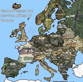
    I chose this map because it really stood out to me. I like that it's a map about something that you wouldn't see often, rather than just being another map of where things are, but rather focuses on the differences and similarities of neighboring locations. The map itself stood out to me, as I feel like it really catches your eye and makes you look and truly want to see what the map is about. I truly feel like you can look at this and take things away from it, that maybe you wouldn't have known before. 

    Something that stood out to me upon looking at the map was how all of the camouflages were different. Some of them did look similar, but there is at least one aspect of difference in every single one. I think that it allows one to look and really think about how although there is something similar, not only in this but in every aspect of culture, there are still differences. Personally, I never looked at camouflage deep enough to see that there are differences, or even that there could be differences, but this map allowed me to take a deeper look and see that there are. 

    Another thing that stood out to me about this map is that the area that it covers is smaller than a lot of the maps that I have seen in the past. I think that typically, when I see a map it covers a larger surface area. Looking at this map allowed me to really focus on a smaller area and really see the similarities and differences of neighboring locations by focusing, rather than trying to look at too much at a time. 

    I also found it interesting that when looking at the rifles, some were different while others were the same. I think that this can again tie back to the idea of culture, about how there are shared and different characteristics. Even though the countries could possibly fight against each other, the rifles that they are using are the same, but there are some distinctly different ones at the same time. 

    Overall, I think that a key takeaway of this map is that even in neighboring locations, there are characteristics in any aspect, even warfare, that are the same, while there are also ones that are different. None of them are exactly the same, thanks to those non-shared traits, however not one is superior to another thanks to the shared ones. I think that this can apply to any aspect of culture, that none are exactly the same, but that they are all just as important as the next one. 


Skye's Interesting Map


    This is a map from Warriors, a fictional book series written by Erin Hunter about clans of anthropomorphized cats. The different clans lie in different territories as marked on the map. I don’t deny that I chose this map due to being a fan of the series, but I think there are some interesting insights that can be taken away from it.  
    The map is labeled from the perspective of the cats, who have their own names for the things that they have encountered. Such names include “twolegplace” instead of neighborhood and “thunderpath” instead of road. It is also worth paying attention to what is and is not named. The cats have different regions and landmarks that are important to them and are therefore labeled on the map. If a human in this fictional universe were to label this area, they may have given more attention to the different houses and roads while not being so specific with labeling the surrounding wilderness. 
    The ecological features of the different clans and  their surrounding areas also correlate to each clan’s abilities and customs. RiverClan cats live near a large river and therefore primarily eat fish and are better at swimming than cats from other clans. WindClan’s large open area is reflected in its residents’ ability to run fast and preference to sleep out in the open instead of in dens. ThunderClan cats are great climbers due to the surrounding trees. ShadowClan’s lower elevation and seclusion give its cats privacy but also cause them to be misunderstood by the other clans. 

Noely's Interesting Map

China's World Map


    At first glance, you may say, "This map is wrong. It looks weird." Weird, yes from an American perspective. Wrong, not quite. This map is China's map of the world. The first key difference I noticed was where the countries were located. Traditionally, in the United States and most parts of the world, Europe is in the center of the map, the Americas are in the eastern hemisphere, and Asia is in the western. However, I took notice of China's centered position and the tiny European countries. This sizing and localization of the world map bring in the idea of centrism that I find interesting. I realized by looking at this version of this map that the maps that I am used to and are used all around the world hold a Eurocentric view of the world, holding Europe at its center and making other countries like Africa smaller than what they actually are. 

    When examining this map I quickly decided to look for Taiwan. I would have expected to either see the country not have a color at all or it to be the same color as China. As I should have guessed, it was the same color as China, pink. Through China's map, you can take notice of their geopolitics. Although few countries officially recognize Taiwan's independence (the U.S. is not included), through this map you can see China's perspective of dominance it has over the country. This detail was interesting to me because I realized even geography can be about perspective and your environment. A student in China is going to learn that Taiwan is rightfully a part of China and not raise any questions about it because it is what they have been taught. There is no reason to question if you were made to believe it is true. 

    The final detail I was intentionally looking for was China's 9-dashed line, which I quickly counted and spotted. The 9-dashed line interests me because it was the reason the Barbie movie was banned in Vietnam. China claims that the "South China Sea" belongs to them while Vietnam contests the "East Sea" corresponds to them instead. Both nations claim to have control over this sea and I find it amusing that Vietnam took it so seriously as to ban the highest-grossing film of 2023 over an assumed 9-dash line. This, again, feeds into my interest in the geopolitics of the world. 

Eva's Interesting Map: Languages of India


It's known that there are many different cultures and people in India. But I didn't realize just how many languages were spoken within the country. This map shows what regions of India speak a specific language. When people think of languages spoken in India, they may think of Hindi as the main language, but there are actually 121 languages spoken there. I find this to be very interesting because it makes me wonder how culture varies from each region just bease on the language they speak. Could there be any conflicts do tho the many different languages?

There are many aspects in Indian culture that are still prevelent today. These are a result of cultural diffusion within the country. One thing this map has made me wonder is if all these languages were first spoken in India or if they were brought by other settelers and were then picked up by the Indian people. I think it would be interesting to learn about some of the history behind these languages. I would like to know if it is hard for people to nevigate the different regions of India because there are so many languages spoken there.

Abbee - Interesting Map


        This is a map of the forecasted bird migration of fall 2024 on the night of August 29th. Through the weather and reported observations, ornithologists can predict the number of birds that will be migrating through the United States as well as what areas will have the most amount of activity. This information is then put into maps on this site, https://birdcast.info/. 

    There are many things I like about this map. I find it easy to read because of the major difference between colors. Generally the lighter the color, the heavier the migration is in that area. I also like that it includes colors that show what areas are expecting rain that night. Areas expecting rain may see more birds stopping over if conditions aren't right for flying. Migrating birds fly over at night, so this site also shares the predicted time the birds will be flying over.

    BirdCast is an amazing resource for anyone interested in birds and their migration flights throughout the United States. By highlighting the areas with the highest predicted activity and incorporating precipitation data, this map helps birders, conservationists, and more to appreciate, understand, and protect birds .


Interesting Map - Hunsicker

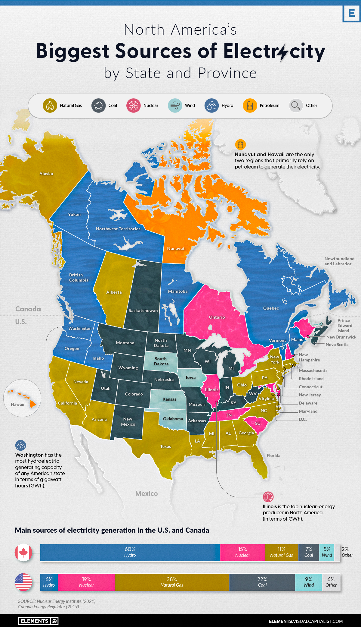
    The map pictured above comes from visualcapitalist.com, which used information from the Nuclear Energy Institute and the Canada Energy Regulator to assemble a map of the most used sources of power in the United States and the provinces of Canada. The United States is far behind on renewable resources such as hydroelectric dams, wind, and solar, due to partisan reasons within the US government. Renewable resources only make up around 15% of our electric generation compared to the 65% that Canada produces.

    A major reason I chose this map is that I love talking about renewable resources and how to improve our environment in so many different ways. Though the United States is far behind on renewable resources, we still have the highest hydroelectric generation, which is generated in Washington state, and the top producer of nuclear energy, which is produced in Illinois, shows that there is still hope for a renewable future. Another reason why this map just feels super interesting to me is that both Hawaii and Nunavut are the only users of oil as their primary electric producers in the North American continent.

Interesting Map- Light Pollution Over Time

This Is How To Bring Dark Skies Back In An Increasingly Developed World


This is a map of Light Pollution in the United States, the brighter areas represent polluted areas with corresponding colors representing levels of light pollution while the black areas represent places with little to no light pollution.


I find this map interesting because it helps point out many areas of interest such as human impact on the environment, technological development, urbanization and suburbanization and population growth. For example if you were to compare the light pollution being emitted from major cities such as New York in 1997 to light pollution that's expected in 2025 you will notice almost all major urban centers are colored white or pink on this map meaning that the brightness level is 27-243 times the natural level making almost all stars in the sky invisible. Furthermore Most people in the United States live in either the orange, red, or white and pink areas meaning at the very least the majority of Americans cannot see the Milky Way and at worse (such as in urban areas) people won't be able to see practically anything of interest. This is particularly alarming because for thousands of years we've been able to look up at the night sky and see the beauty of the universe, behold constellations and even our own galaxy which has helped ground us as both a species and individually. It also has negative health affects on humans, as light pollution can disrupt our circadian rhythm. It's truly one of the saddest consequences of the development of human cities and technology and unfortunately the problem is only getting worse year by year. If you want to explore light pollution around the world here's a couple of websites with interactive maps:


https://www.lightpollutionmap.info/#zoom=9.57&lat=48.5111&lon=-112.9793&state=eyJiYXNlbWFwIjoiTGF5ZXJCaW5nUm9hZCIsIm92ZXJsYXkiOiJ3YV8yMDE1Iiwib3ZlcmxheWNvbG9yIjpmYWxzZSwib3ZlcmxheW9wYWNpdHkiOjYwLCJmZWF0dXJlc29wYWNpdHkiOjg1fQ==


https://darksitefinder.com/map/

Madison's Interesting Map


Mark Bradford

American, 1961


Scorched Earth, c. 2006

Mixed media on canvas

95 1/4 x 118 1/4 x 2 1/4 in.


At first glance, this looks like an ordinary painting. But what if I told you that this art object also serves as a map? Art and cartography go hand in hand as several historical and contemporary artists interpret data from maps and cultural landscapes into fine art. In this instance, American abstractionist Mark Bradford explores large-scale, abstracted mark-making as the building blocks to explore Black communities' political and socioeconomic standing in America. Bradford works at the intersections of anthropology, archeology, and psychology– which is not uncommon among artists who wish to unpack emotional disruption and turmoil passed down from generation to generation. Scorched Earth visually documents the Oklahoman culture post-Tulsa Race Massacre in 1921. 


From May 31 until June 1st, 1921, affluent Black communities in the Greenwood District of Tulsa were torched by White supremacists, injuring around 800 people and killing around 300. Over 35 blocks of successful, bustling city streets were burned to the ground, displacing over 6000 people and destroying the success that they had built over decades. Not only is this a devastating attack, but much of it went largely undocumented– we might never know the entire truth of what happened. 


Bradford references topographic maps and public records in combination with found objects to create his mixed media work, all while mentally sifting through how the White supremacy of the past will rear its ugly head in the future. The intensity of the orange paint and disorienting composition highlight how quickly Tulsa fell into ruin after the Massacre. Bradford mimics the city grid lines and streets using vertical and horizontal lines and built-up materials, layering the surface texture continuously. As the image area of the map becomes more tactile, the piece becomes more visceral as it extends out from the canvas. Perhaps this is a metaphor for the way that history builds upon itself. Unsurprisingly, Tulsa still has not quite recovered over a century later. Scorched Earth exists as a reminder of that.


Katelynn "Brie" Humbles - Map of the Second Floor of the Philadelphia Museum of Art


The Philadelphia Museum of Art is one of the oldest art museums in the country, and has been distinguished since its founding as being among the very best. The collection of more than 200,000 relics and works of art reflects the unique history and the passions of generations of Philadelphia collectors and curators. By the time of its foundation, the museum remained true to its origins as an educative institution and to the principle that the arts could positively transform society.

In short—this is a world-class art museum, ranking 3rd or 4th in the United States. One cannot possibly see it all in one day; you must target what you're interested in and focus on that. They do periodic special exhibits which cost extra, and you need to get timed tickets to those, but they are absolutely worth visiting. To name but a few exhibits, there are rooms filled with furnishings from various periods, a complete Hindu temple, a complete Japanese teahouse, and even a complete room from a Chinese palace. 

Across the street, the Perelman annex has seasonally-changing exhibits admission is on the same entry ticket as the main museum; there's a lovely sculpture garden by the parking garage lobby; and the Rodin Museum down the Parkway is also part of the PMA. There are frequent no-extra-charge docent tours sign up in advance. Not to mention that the cafeteria is nothing to scoff at, so you can plan on spending the whole day immersed in the works of art featured on display.

The second floor of the museum contains a handful of my favorite movements, including Impressionism, Modern, and Contemporary. For this reason, it is the map I chose to feature above the rest. But, above all else, this floor features a particular statue in the grand stairwell. Diana, popularly known as Diana of the Tower, is the gold statue of the goddess Diana done by an American sculptor, Augustus Saint-Gaudens. A major icon in the City of New York, the second version stood on the tower of Madison Square Garden from 1893 until 1925, while the original has been part of the collection of the Philadelphia Museum of Art since 1932.

Kay’s interesting map


 This is a geographical map of the United States of America. This is a part of a survey done to see what people call soft drinks. The cyan/blue represents the counties that call soft drinks “soda”. The magenta is for the people who call soft drinks “coke”, and the yellow is for the people who call soft drinks “pop”. 

One thing I find interesting is that the amount of people who call soft drinks “pop” are just about all the northern half of America (excluding parts of Wisconsin and the New England Northeast). I have family who live in Canada in the provinces that border the United States, and I have noticed that they also tend to call soft drinks “pop”. This is most likely from immigration between the northern parts of America and Southern Canada. When talking with some locals from Canada, they stated that it was a common practice for citizens who live by the border, such as St. Stevens, New Brunswick, to cross over said border for work or gas. This is because of the fluctuating strength between the US and Canadian currency. When the Canadian dollar was strong, more American citizens would travel to take advantage of the exchange rate and vise versa. This melting and conjoining of people and their customs gives ample time for the spread of language and vocal mannerisms. 

(Below I have added a geographical map of Canada with information of what they call soft drinks by provinces and territories)